SalesMasters 2.0 – Doubling
Affiliate Program revenue
Redesign and strategic rebuild of x-kom’s affiliate program that grew revenue by 130% while keeping commission cost 27% below target.
Overview
SalesMasters 2.0 is a complete redesign of x-kom’s affiliate program, covering the attribution model, commission logic, and product architecture. The goal was to maintain revenue scale while increasing transparency, cost control, and long-term credibility. The project combined product strategy, research, and commission model redesign into a single systemic change.
My Role
I led the UX and UI redesign in collaboration with the Product Owner, analytics, and tech team.
My responsibilities:
- Designing and conducting quantitative and qualitative research (survey creation, interview scripts, co-facilitating sessions).
- Translating insights into system and product requirements.
- Benchmarking affiliate models to define strategic direction.
- Shaping attribution and commission logic from a UX perspective.
- Designing the new dashboard architecture and core user flows
Problem
The program operated on a cookie model (5 days) with low transparency and inconsistent attribution.
Affiliates did not understand the rules for awarding commissions. Gaps in tracking reduced credibility, and the model rewarded traffic capture rather than the quality of recommendations.
The business faced a decision: extend the model into a loyalty scheme, or redesign the fundamentals.
Solution
We rebuilt the system around intent-based attribution and clear commission logic, and redesigned the interface to reflect this new model.
SalesMasters 2.0 introduced:
- 24-hour, cookieless attribution.
- Full commission for the recommended product, partial commission for other purchases.
- Permanent, simplified link structure.
- Unified dashboard across group brands.
- Order-level commission transparency.
The UI shifted to a task-oriented dashboard focused on earnings management.
The result was a system where attribution logic, commission economics, and interface structure were aligned – both technically and behaviorally.

Let’s see how I got here 👇
Design process
This case study highlights selected strategic decisions. The full scope included:
Research
- Desk research
- UX audit
- Survey
- IDIs
- Competitive analysis
Define
- Product vision alignment
- User segments
- User stories
- MoSCoW
- Information architecture
- Use flows
Design & Validation
- Lo-Fi prototypes
- Hi-Fi prototypes
- Usability testing
- Iteration cycles
Desk research synthesis
The first stage of research involved getting to know the data on the current version of Salesmaster: Hotjar, GA. This was followed by desk research, guides, forums and research on affiliate marketing.
Registration ≠ Activation
Only 4% of users generated sales regularly. The majority dropped off after registration.
Design Implication
Simplify the interface and better guide the user to their first success.
Trust was the bottleneck
Users questioned calculations. They did not understand why commissions were approved, rejected, or reversed.
Design Implication
Reveal the commission logic and turn reports into real decision support.
Psychological safety
SalesMasters functions as a financial interface, where ambiguity increases perceived risk.
Design Implication
Redesign payouts as a trust-building experience with clear rules.
User validation & insights
To validate insights from analytics and desk research, we ran a survey followed by IDIs in close collaboration with the Research team. We confirmed behavior patterns and identified gaps in trust.
Cash, not points
Real cash builds credibility. Points feel artificial.
„When it comes to points, I associate it with something trivial.”
– Leader segment
„Bank transfer – the most convenient and universal method.”
– Geek segment
Design Implication
Despite early business pressure toward a points-based loyalty model, research across both segments was clear enough to recommend dropping it entirely – cash as the only default payout.
Product quality is more important than commission
Users recommend what they trust
„What I like most is when, I recommend something and someone then writes in the comments that they bought it and it helped them.”
– Leader segment
„I’m just the kind of person who likes to help people.”
– Geek segment
Design Implication
We should provide data that builds trust that this product is recommended.
69%
respondents promote products they know to help others.
Earnings are the entry point
But not the whole story
„Such programs don’t really offer anything else besides salary.”
– Leader segment
„I am just the kind of person who likes to help people, if I know something about it, of course.”
– Geek segment
Design Implication
Position earnings transparency as the primary acquisition lever.
62%
say salary is the most important motivator
Links and statistics are crucial
Users want to earn – not features to play
„These users will simply recommend some useless equipment just to be higher in the rankings and earn a bigger commission.”
– Leader segment
„how many visits, clicks, page views, purchases, how many people used it”
– Geek segment
Design Implication
Priority in the roadmap: link flow optimization, link generation from PDP, link shortening, statistics panel. Gamification outside the roadmap.
Research-driven segments
Research revealed two distinct behavioral models. The difference wasn’t demographic, but behavioral – how users work, what they optimize for.
Leader (~20%)
Scale-driven, revenue-focused
- Publishes recommendations publicly (YouTube, Discord, blogs)
- Treats affiliate as structured income
- Needs advanced analytics & clear attribution
Design Implication
Performance dashboard · Transparent commission lifecycle · Structured link management
Geek (~80%)
Trust-driven, help-first
- Shares links privately (Messenger, WhatsApp, email)
- Recommends when asked, not on schedule
- Treats commission as secondary to helping
Design Implication
Short, clean links · Clear order & commission status · Lightweight statistics
Core decisions
Unified affiliate panel across Group Brands
Affiliates used separate systems for x-kom and al.to, with separate tracking and commission views.
We combined all brands into one panel – a single source of truth for links, commissions, and payments.
This reduced friction, simplified performance tracking, and created a scalable foundation for future brands without duplicating systems.

Link & Attribution model redesign
We have redesigned our attribution logic to reward intentional referrals rather than passive cookie capture.
The new model is based on: intent in the first session, product relevance, and clear commission rules – without relying on cookies.
Before – Cookie-Based
- 5-day browser cookie tracking
- Full commission for any product in cart
- 30-day link expiry
- Cookie overwrite competition (last-click wins)
- Tracking breaks with ad-block / mobile app
After – Intent-Based
- 24h session attribution window
- Partial commission for unrelated products
- Permanent link (no expiry)
- Full commission for recommended product
- Cookieless tracking across all devices
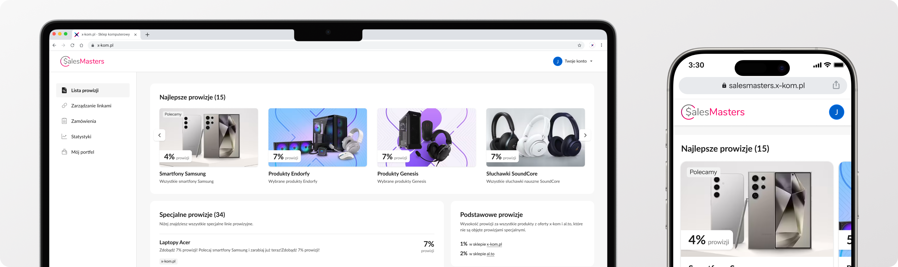
Shift: from informational layout to dashboard architecture
Previously: content layout, static sections, reading-based navigation.

Commissions as the default entry point
We reframed the product around earnings from the first screen. After logging in, the user is taken directly to the commission list, with the latest and highest-paying offers highlighted.

Commissions
- The most profitable opportunities are visually prioritized without hiding the full offer.
- The structure is scalable – badges allow for easy addition of filters in subsequent iterations.
Deep-link generation for any URL
Previously, affiliates could create links only for product and category pages. We expanded this to any valid URL across x-kom.pl and al.to including campaigns and landing pages. Links were standardized into clean, shortened URLs with a single 8-character parameter, improving shareability, reducing friction, and increasing trust across external channels.
Link Generation
- Removed friction from the sharing moment – the link is in the clipboard before the user even thinks about copying it.
- We reduced visible UI elements, while preserving discoverability through motion.
Transparent commission lifecycle
We redesigned order tracking as a commission lifecycle view from unclear calculations to clear, traceable statuses.
Orders
- Status visible on list level.
- Product level commission breakdown.
From reporting gap to decision support
Context
The system showed earnings but lacked actionable insight. To understand real analytical needs, I conducted in-depth interviews focused on how users interpret data and optimize performance.
Research insight
Users:
- Optimize links and product selection.
- Compare results over time and across categories.
- Need visibility into conversions, not just commissions.
- Some export data externally.
Design Shift
- Clear relationship between clicks, orders, conversion, and commission.
- Time filtering and comparative views.
- Visibility of top performing links.
- Alignment with order statuses and attribution logic.
- Goal: to support informed decisions, not passive monitoring.
Age verification at payout
We decided to move age check from registration to reduce friction. Anyone can join and start earning right away.
Payout
- Age is verified only at payout, automatically based on PESEL.
- Users under 18 can withdraw funds with verified parental consent.
Impact
The combination of redesign and intensive marketing activities enabled very rapid growth while maintaining appropriate costs.